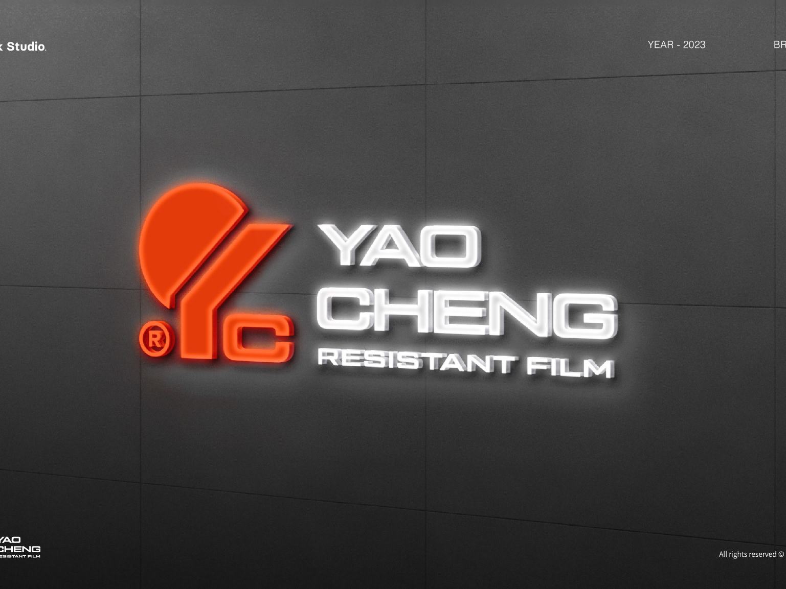
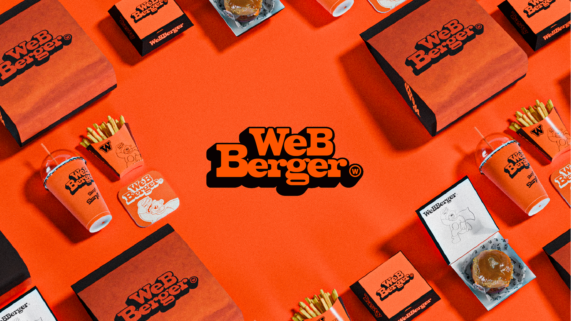
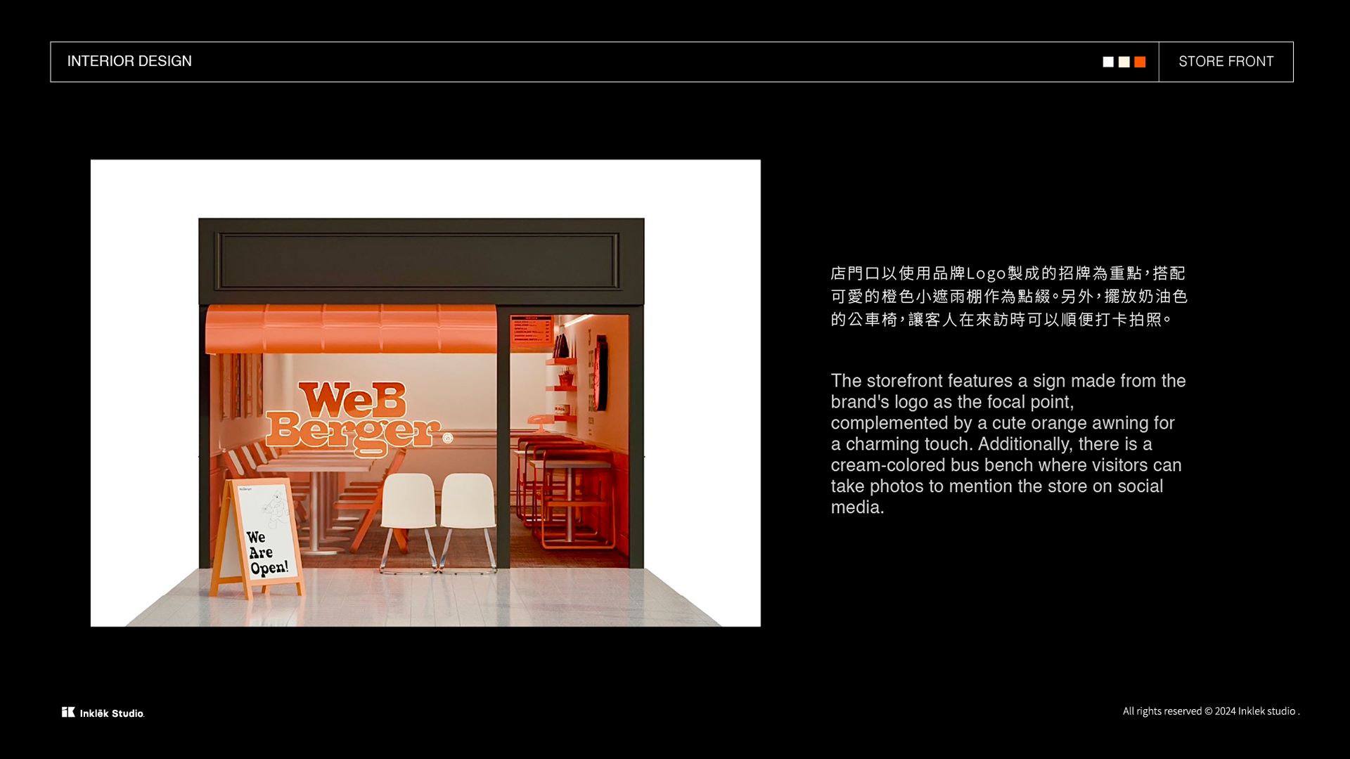
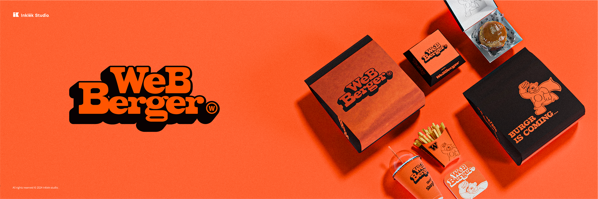
Inklēk Studio 為來自高雄的WEBBERGER漢堡店的嘉義新店所設計的全新店面LOGO
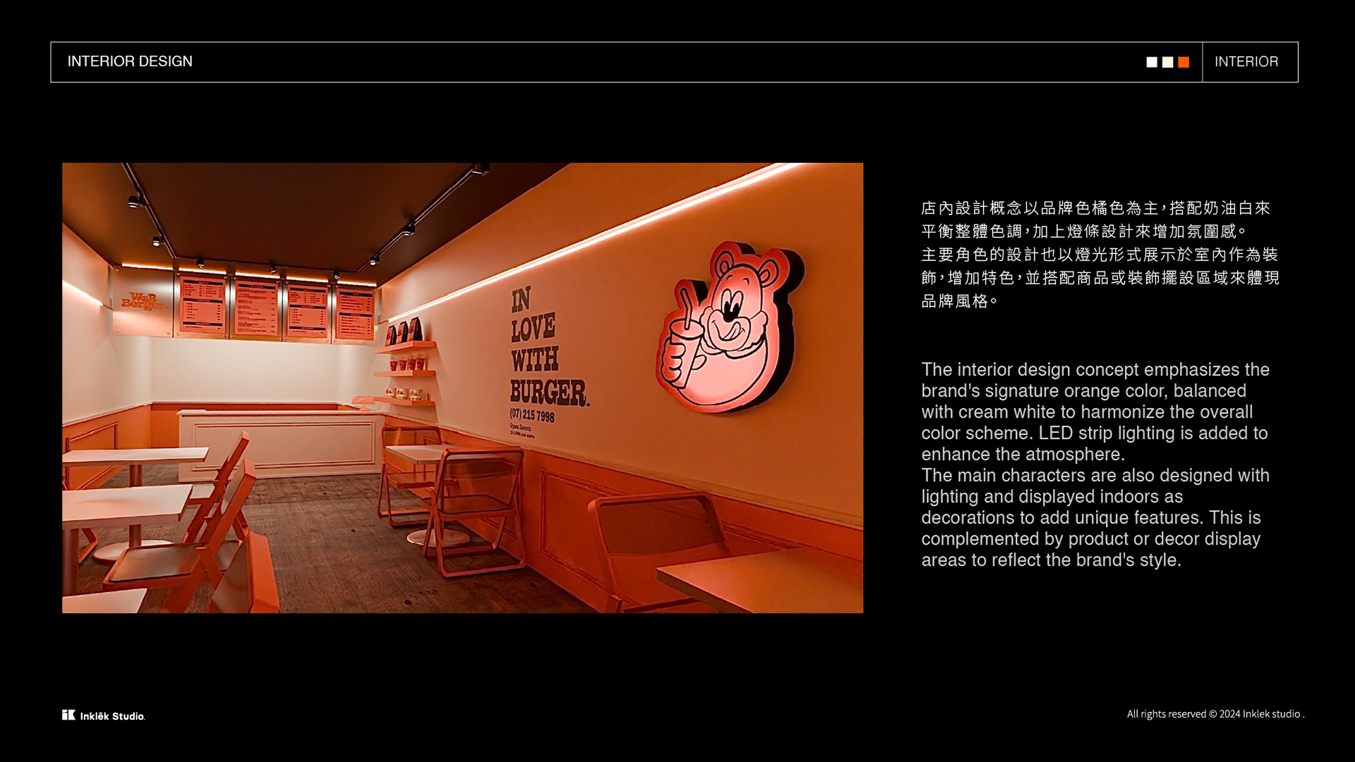
美式復古與潮流風格結合餐廳,打造出食慾豐沛且有趣的視覺體驗。
美式復古與潮流風格結合餐廳,打造出食慾豐沛且有趣的視覺體驗。
♦ LOGO設計理念:
我們選用俏皮的美式復古風格字體,結合鮮明的橘色,以增強品牌的辨識度。這種字體風格帶有懷舊的氣息,能夠吸引目光並給人留下深刻的印象。橘色則象徵活力與創新,同時也傳遞出熱情和積極向上的品牌形象。
我們選用俏皮的美式復古風格字體,結合鮮明的橘色,以增強品牌的辨識度。這種字體風格帶有懷舊的氣息,能夠吸引目光並給人留下深刻的印象。橘色則象徵活力與創新,同時也傳遞出熱情和積極向上的品牌形象。
We chose a playful American vintage-style font and a vibrant orange color to enhance brand recognition. This font style has a nostalgic feel that catches the eye and leaves a lasting impression. Orange symbolizes vitality and innovation while conveying a passionate and positive brand image.
♦ 品牌圖標角色設計
WEBBERGER英熊的設計靈感來自復古美式吉祥物,結合了高雄本店的英雄元素,誕生了一個貪吃的棕熊形象,披著披風並戴著面罩。面罩和頭盔的設計靈感源自美國英雄美國隊長的早期設計,並搭配顯眼的披風以強化角色特徵。
通過結合動物和英雄元素,未來的加盟店可以基於這個角色進行延伸,增添更多的多元和豐富感。
WEBBERGER英熊的設計靈感來自復古美式吉祥物,結合了高雄本店的英雄元素,誕生了一個貪吃的棕熊形象,披著披風並戴著面罩。面罩和頭盔的設計靈感源自美國英雄美國隊長的早期設計,並搭配顯眼的披風以強化角色特徵。
通過結合動物和英雄元素,未來的加盟店可以基於這個角色進行延伸,增添更多的多元和豐富感。
♦ Character Design Concept:
The design of WEBBERGER Bear is inspired by retro American mascots and incorporates heroic elements from the flagship store in Kaohsiung. This resulted in the creation of a food-loving brown bear wearing a cape and mask. The mask and helmet design draw inspiration from the early designs of the American hero, Captain America, and feature a prominent cape to enhance the character's traits.
By combining animal and hero elements, future franchise stores can extend this character, adding diversity and richness to the brand.
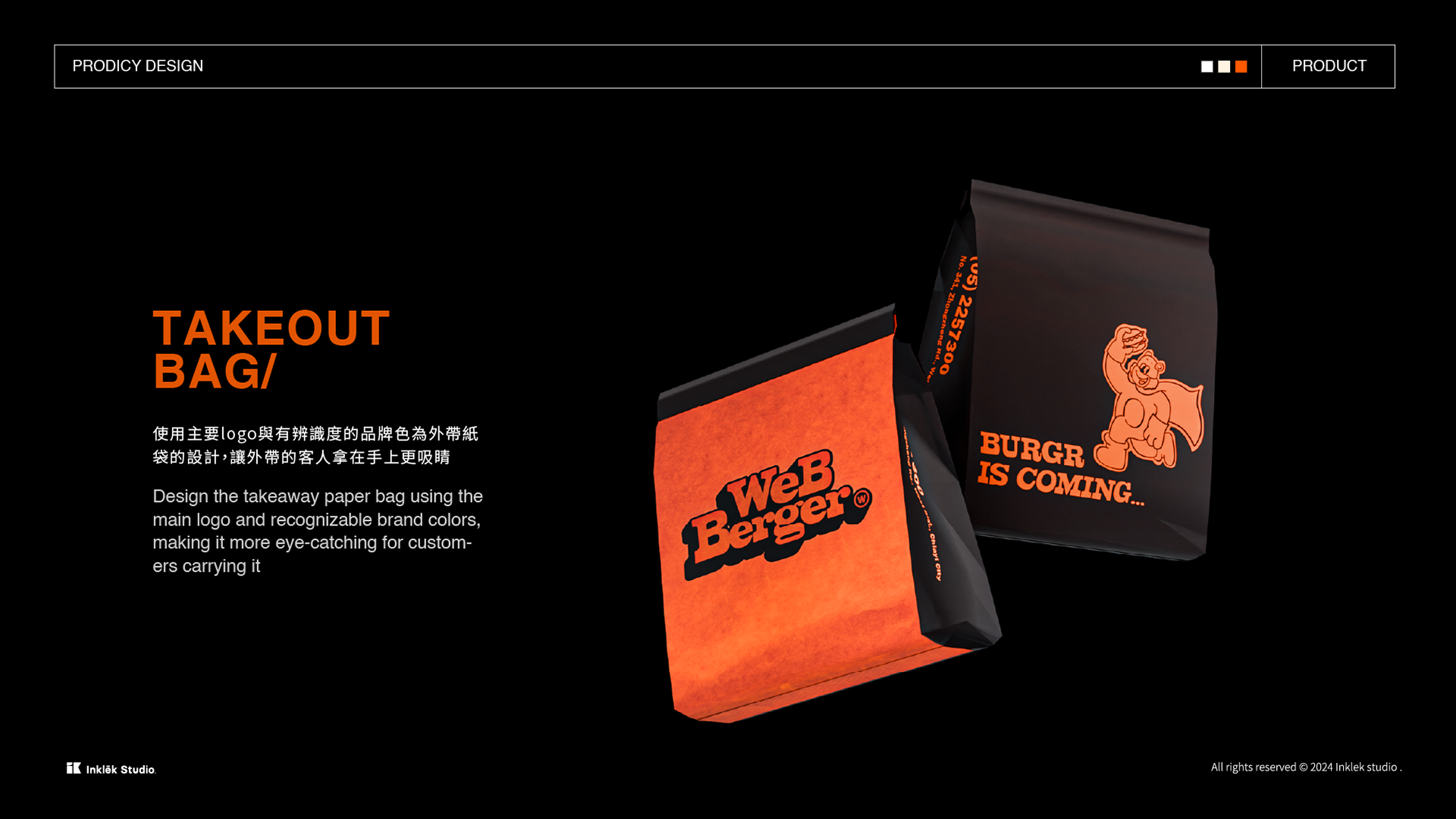
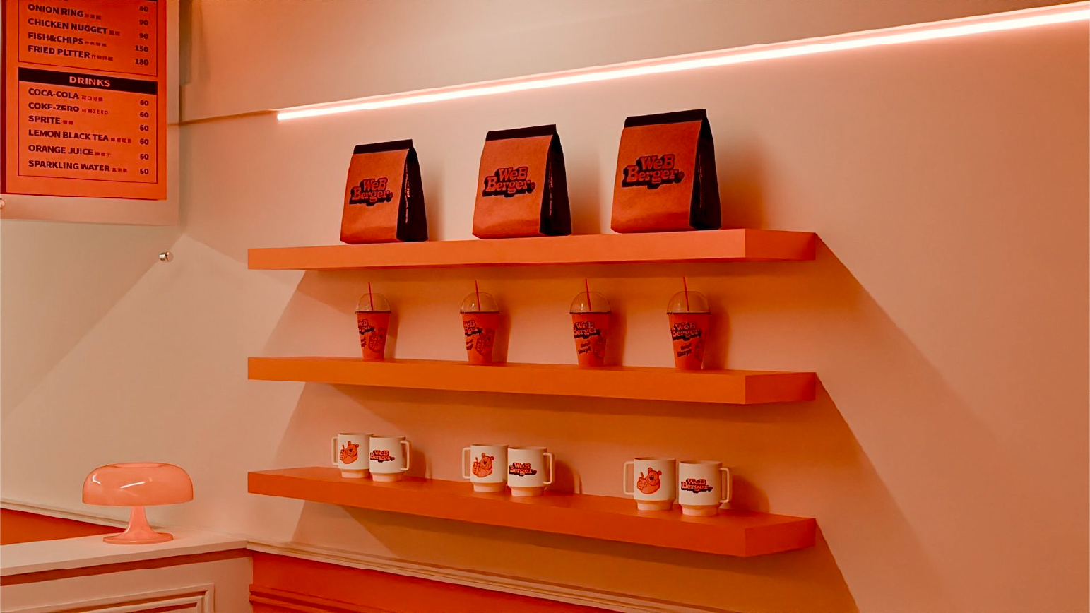
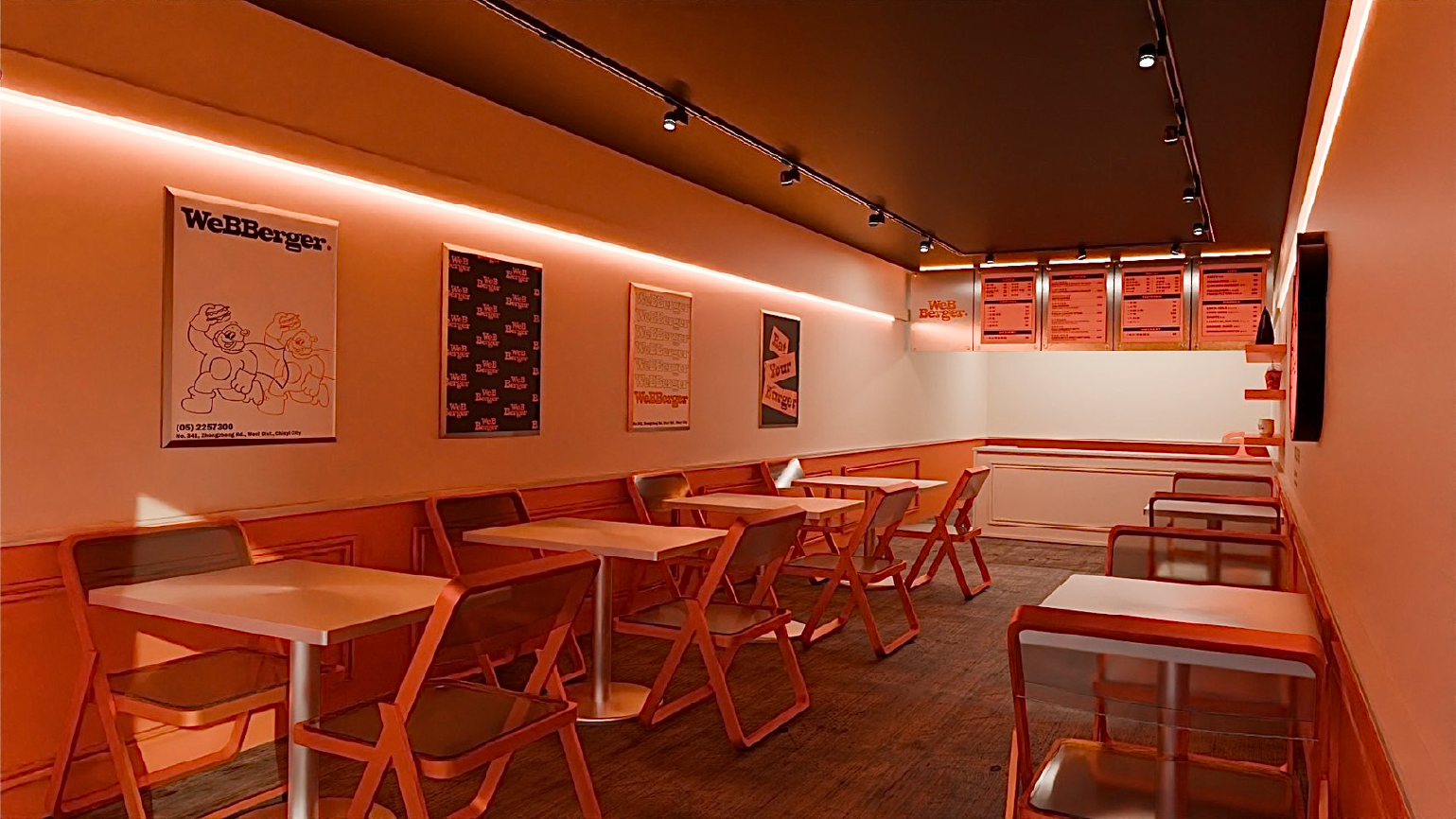
與WEBBERGER玩創美式復古的形象LOGO,增加店內的特色與辨識度
讓橘色主色調的復古美式品牌角色,引人注目並印象深刻
讓橘色主色調的復古美式品牌角色,引人注目並印象深刻
為每個品牌創造專屬於你的視覺故事
讓印象傳播無遠弗屆。
讓印象傳播無遠弗屆。
Better life, I’m in.
如果你也想讓設計與理想相關,聯繫我們,共同創造更多可能!
📩 inklekstudio@gmail.com